- Home
- About AAHN
- Membership
- Research & Resources
- Publications
- Conference
- Members Only
- Contact Us
|
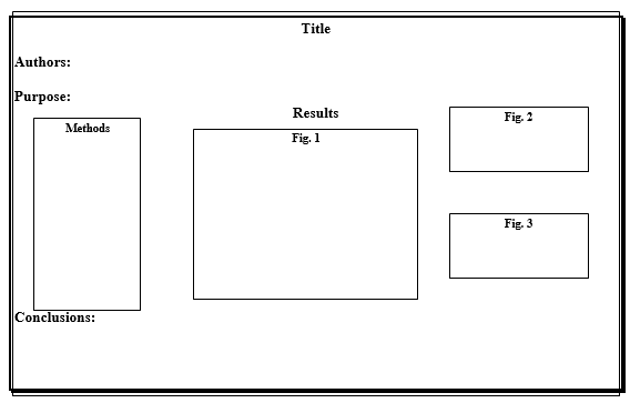
AAHN GUIDELINES FOR POSTER PRESENTATIONS Poster presentations offer a unique opportunity for dynamic interaction between authors and viewers, allowing for the exchange of diverse insights in a short time. The success of this interaction relies heavily on the visual clarity of the poster. If a display is unclear, authors may find themselves repeatedly explaining the basics instead of engaging in meaningful discussions. To help you create a clear and effective presentation, we’ve prepared the following guidelines: A. Components of a Poster Presentation1. Title and Author(s)
Place the title of your work and the names of the authors prominently across the top of your display. This ensures viewers can easily identify your presentation and find you for discussion. 2. Purpose or Question
Include a concise statement of the purpose of your work or the hypothesis tested. This helps viewers quickly grasp the focus of your study and frames their understanding of your methods and findings. 3. Methods or Procedures
Provide a brief summary of your methods or procedures using an outline or graph. It’s not necessary to include every detail—highlighting key steps is sufficient to communicate your approach. 4. Results
This section typically occupies the most space on your poster. Focus on presenting your main findings clearly and concisely. Use well-labeled charts, graphs, tables, or outlines, as these are generally easier for viewers to interpret than dense text.
Include a clear conclusions section to summarize the key takeaways from your work and how they relate to your stated purpose. This section should encourage discussion about your conclusions, alternative interpretations, and the broader implications of your research.
B. Poster Preparation Guidelines1. Poster Display Details
2. Design Considerations
3. Professionalism
Avoid extremes: there is no need for expensive professional design, but a hastily prepared or overly simplistic display is equally inadequate. If you need advice on creating an effective yet affordable poster, contact any member of the program committee. 4. Adapting the Format
If your work does not fit the traditional format, ensure that the title, author(s), purpose, and conclusions are clearly presented. Modify the methods or results sections as needed to suit the nature of your work. 5. Additional Materials
You may distribute handouts with the full text of your study or provide links to relevant online resources. However, please note that advertising products is not permitted as part of your presentation. We hope these guidelines help you create a visually engaging and self-explanatory poster, freeing you to focus on meaningful discussions with your audience. Poster Example: |

